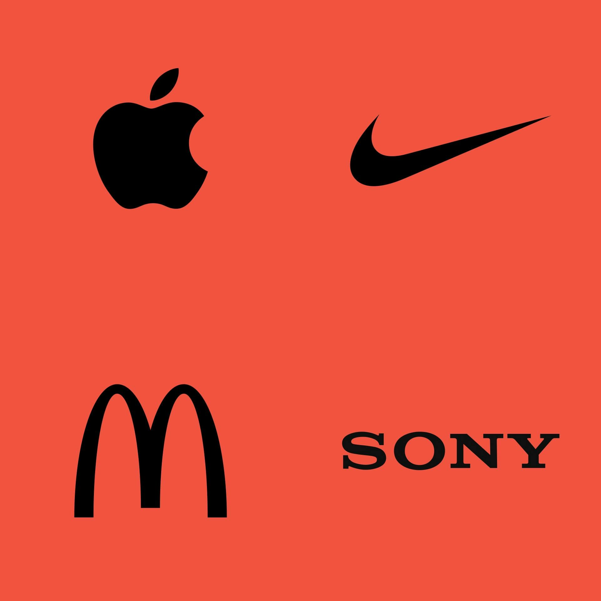
Why are some logos timeless?

In this article, I’ll explore why some logos have stood the test of time and what drives certain organizations to change their logo.
Why do some logos endure?
1. Simplicity
One of the most important aspects of a successful logo is simplicity. If a logo can be easily sketched on a napkin moments after seeing it, chances are it’s simple enough. But why does simplicity matter? For two key reasons. Firstly, a simple logo is memorable. The less complicated the shapes, the easier it is for people to remember. In contrast, overly detailed logos are harder for the brain to process and recall. Secondly, simple logos are versatile. From a tiny social media profile image to a massive billboard in Times Square, simple logos remain legible across all applications. On the other hand, an intricate logo can become indistinguishable at smaller sizes.
2. Trendless
This point ties in closely with simplicity but deserves attention on its own. Logos that have stood the test of time have survived various design trends over the years. From the faux-3D aesthetics of the ’90s to the gloss and shine of the 2000s, it’s easy for companies to be tempted by fleeting trends. However, the logos that last didn’t start out as trends. They are simple marks that work just as well in black and white as they do in colour. No matter what treatment or colour is applied, they remain strong and relevant.
3. Familiarity
This last factor may seem obvious, but it’s worth considering. Timeless logos are timeless because they’ve been around for a long time. The longer a logo is in use, the more familiar it becomes. As more people encounter the logo, it becomes more strongly associated with the brand it represents. Over time, this familiarity becomes a powerful brand asset. Changing a logo risks losing this familiarity and the instant connection it creates. Sometimes, logos become timeless simply because organizations are hesitant to change something so deeply embedded in their identity.
Why do some companies change their logos?
While some logos last for decades, others are frequently updated or replaced. Here are some common reasons why companies choose to change their logo.
1. Generating Buzz
Sometimes, companies update their logo to create buzz. A new logo can spark conversations, generating both positive and negative reactions (think of Pepsi’s logo changes). But as the saying goes, any publicity is good publicity—right?
2. Market Positioning
When a company shifts its market focus, such as transitioning from a budget brand to a premium one, a logo update can signal that change. Kia’s recent rebranding is a good example of this kind of strategic shift.
3. Leadership Changes
New leadership often brings a new vision, and a logo change can symbolize this fresh direction—whether for better or worse.
4. Adaptation to New Applications
As technology evolves, logos need to be adaptable across different formats and devices. With logos being displayed in various sizes and sometimes even in 3D, updates may be necessary to maintain legibility and relevance.
In short
Does an organization need a timeless logo to be successful? Not necessarily. There are plenty of successful companies that change their logos frequently. For example, Pepsi, whose parent company PepsiCo has an annual revenue of $91.47 billion USD, has changed its logo multiple times. That’s a clear marker of success, despite a non-timeless logo. However, companies with timeless logos tend to be inherently successful because they’ve been around for a long time. If you’re aiming to design the next timeless logo, patience is key—after all, only time will tell.