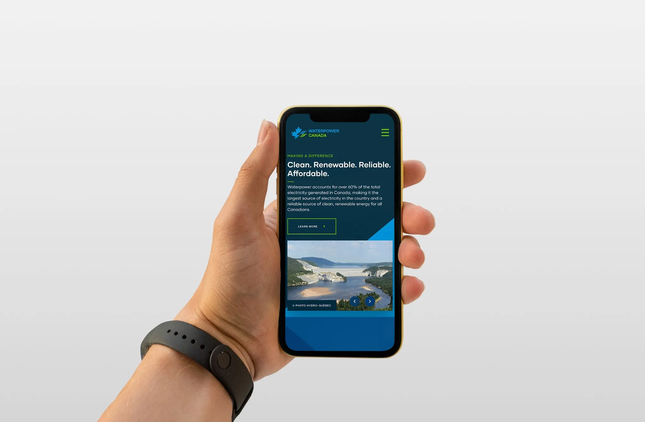
WaterPower Canada
Overview
Waterpower provides more than 60% of Canada's electricity and is the second largest generator in the world, ensuring our electricity grid is one of the cleanest globally. WaterPower Canada came to Factual Studio in need of a full rebranding, as they transitioned away from the original HydroPower Canada name.
Services
- Brand Voice & Messaging
- Brand Identity Design
- Brand Guidelines & Templates
- Brand Collateral

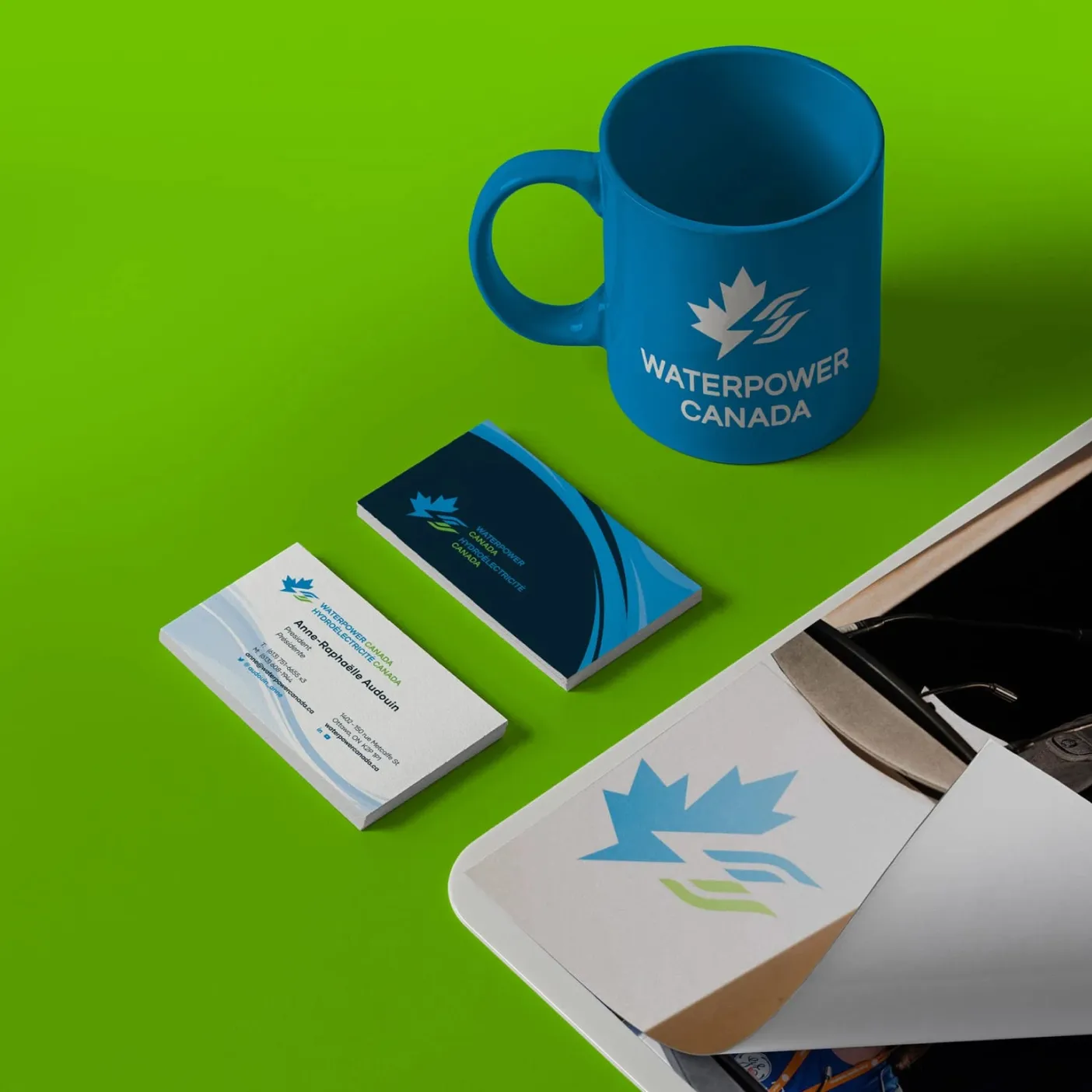
Many concepts were tried for the logo mark. From droplets to waves, everything was considered. The resulting mark conveys a sense of Canada through the partial maple leaf shape, intersected by the lightning bolt in the negative shape (representing electricity). The final piece of the puzzle are the abstract waves representing water.
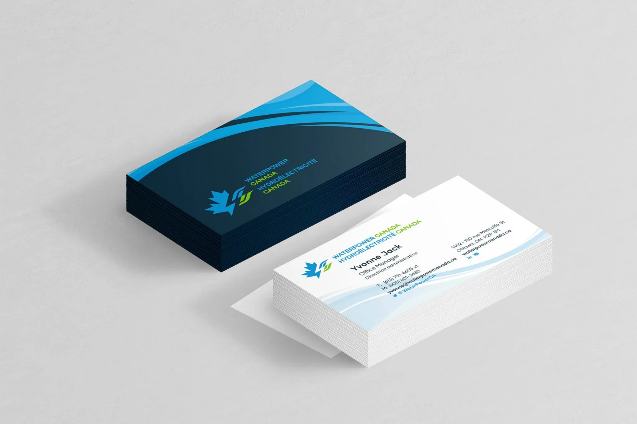
The staff at WaterPower Canada are truly passionate about what they do, and that helped us truly get to the heart of what the new brand needed to represent.
Working with Factual was a real pleasure; from the planning phase through to execution, they made sure we could get a hold of them quickly and worked with us with great flexibility to ensure the final product was as we envisioned.
Anne-Raphaëlle Audouin – WaterPower Canada, Former President
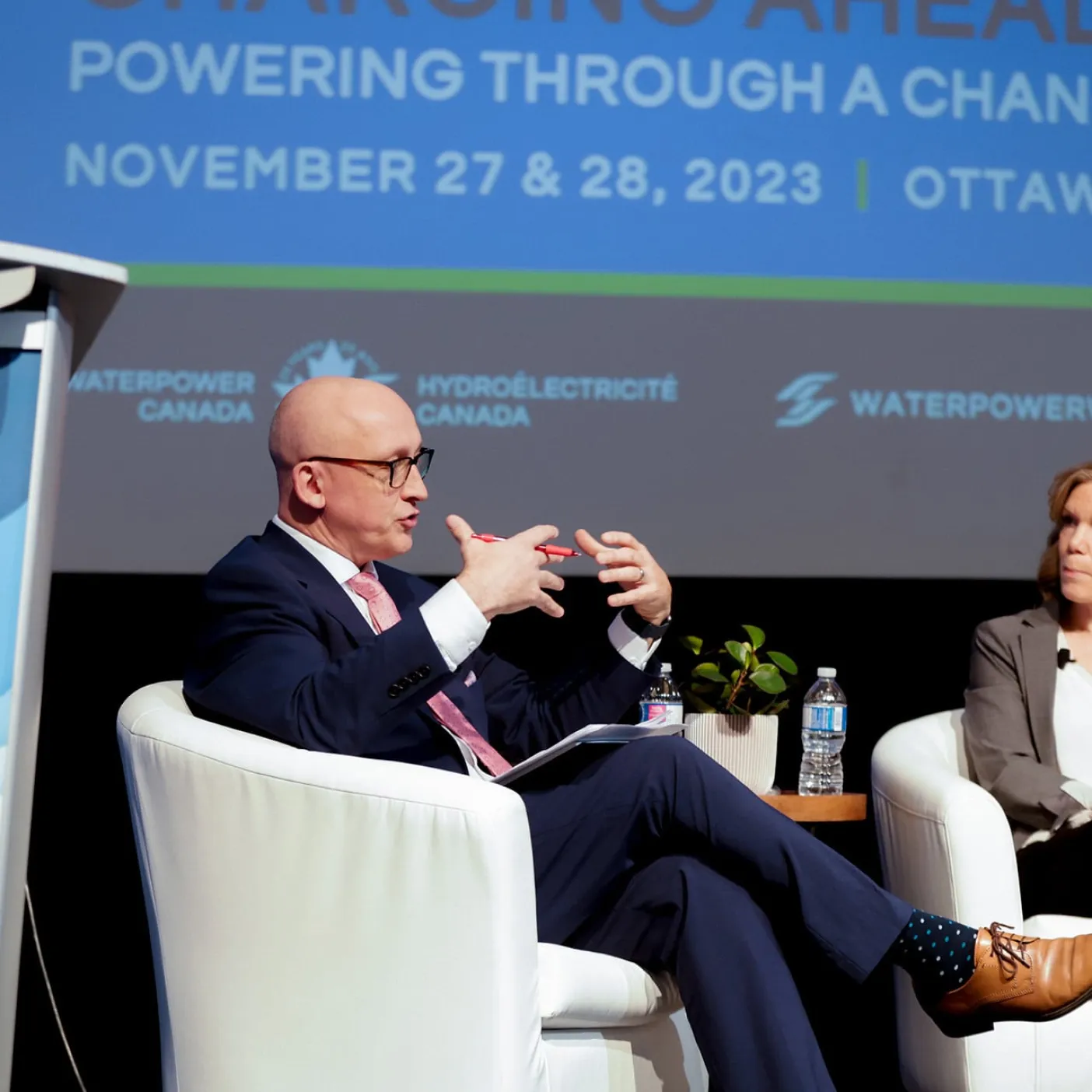
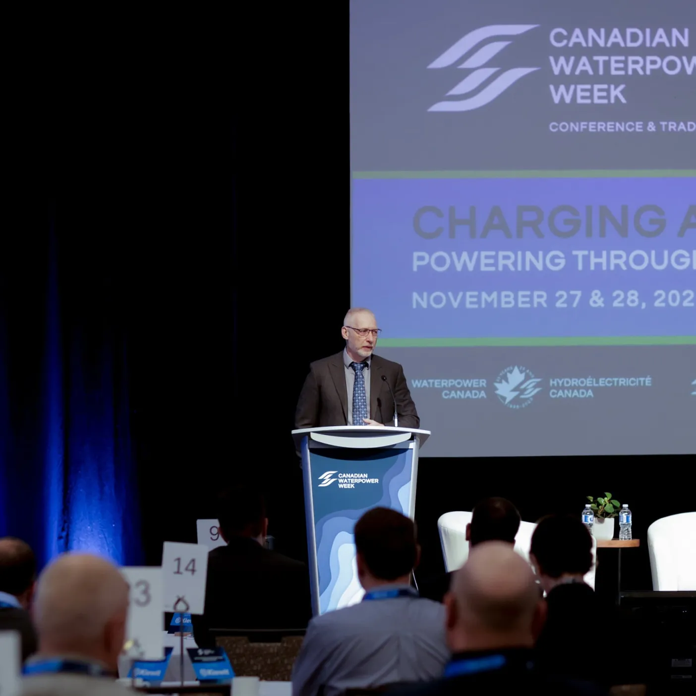
Now that the brand has been out in the wild for a few years now, we have been excited to see how it has been used across their brand touchpoints and annual conferences.
